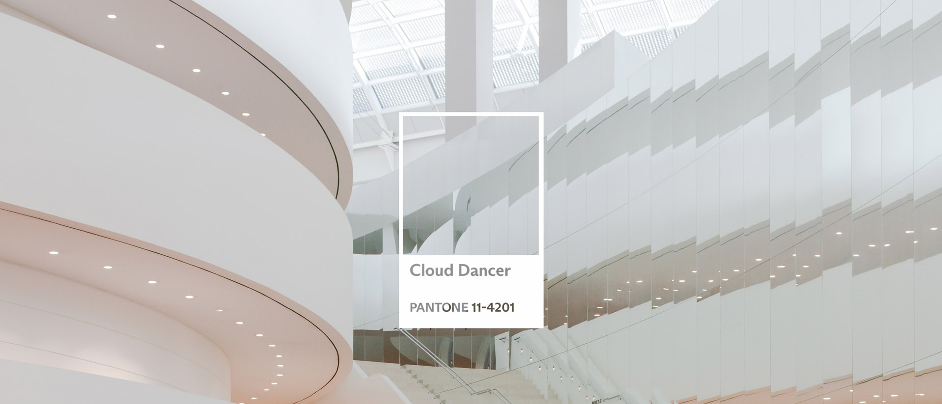
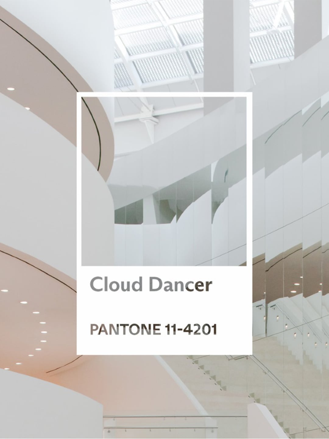
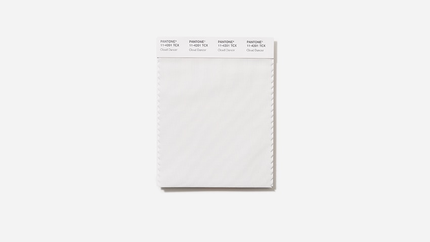
CLOUD DANCER
The Elevated Colour Marina Bay Sands Has Been Speaking All Along
Every December, Pantone drops its cultural weather report: a single shade meant to capture the mood of the coming year. For 2026, that shade is Cloud Dancer—a soft, luminous white Pantone describes as a shade that “encourages true relaxation and focus, allowing the mind to wander and creativity to breathe, making room for innovation.” Pantone’s pronouncement typically triggers a spirited yet highly entertaining global debate over the logic behind its selection, followed by a parade of brands twisting themselves into alignment. Marina Bay Sands, however, doesn’t need to retrofit anything. Cloud Dancer—enigmatic, uplifting, quietly expansive—is already the integrated resort’s native language.
White, the lightest of all colours, is far more complex than it appears. One of the earliest art pigments, it appears in Paleolithic cave drawings where chalk and calcite trace the animals early humans co-existed with. Technically achromatic, it nevertheless contains multitudes: white light carries every colour in the spectrum. It can appear empty yet symbolise potential (a blank canvas), purity (a wedding dress) or peace (a dove). What seems simple often contains far more than it declares. That duality mirrors Marina Bay Sands, where the ease of the guest experience is sustained by a thousand hidden small gestures—often never seen, but always deeply felt.
You sense this before you even enter. Approaching the resort, its glass-and-steel towers and the white lotus form of the ArtScience Museum form a monumental study in Cloud Dancer’s tonal range. But the colour’s influence is perhaps clearest in the resort’s micro-moments. Pantone calls Cloud Dancer “a symbol of calming influence in a society rediscovering the value of quiet reflection”, a mood that threads naturally through Marina Bay Sands.
In the Paiza Collection rooms, Singaporean brand Ploh’s goose-down pillows and ivory duvets cascade from beds like soft waterfalls—a tactile expression of why Cloud Dancer sits comfortably among luxury Pantone colours. Each suite reveals more of what Pantone describes as “a billowy white imbued with a feeling of serenity”: the sensuous curve of a handmade Legle teapot; a translucent alabaster tic-tac-toe set by Italian brand Pinetti, the cool, veined marble cladding entire bathrooms in quiet opulence.
Outside the rooms, Cloud Dancer continues to surface in precise, sensory details. In the spa, glittering shards in the ice fountain catch the light like freshly fallen snow. At Milos, the ivory sheen of Greek yoghurt ice cream is brightened by the golden glow of thyme honey from sunlit Kythira. At one-Michelin-starred Waku Ghin, luminous porcelain perfectly frames seafood harvested from briny depths mere hours before. Multiple storeys above, cumulus clouds drift above the infinity pool in a living echo of the shade; on clear mornings, early light washes the SkyPark Observation Deck in the same elevated, expansive qualities Pantone attributes to its Colour of the Year. Even the whisper-light foam of a cappuccino—delivered before you even knew you wanted one—lands with the soft, sleek precision Cloud Dancer exists to describe.
This interplay between the seen and unseen is the essence of Marina Bay Sands’ guiding ethos, Above Beyond. Not maximalism, though the resort can do scale better than almost anyone; rather, a disciplined clarity. Comfort without excess. Spectacle without noise. Cloud Dancer articulates that balance with unusual accuracy.
Pantone’s Colour of the Year is meant to signal a cultural mood. This year, it also makes something obvious: some places speak a colour fluently long before anyone names it. To understand why Cloud Dancer resonates—and how one metamorphic hue can shape an entire stay at Marina Bay Sands—you only need to step inside. The spaces will reveal the rest.